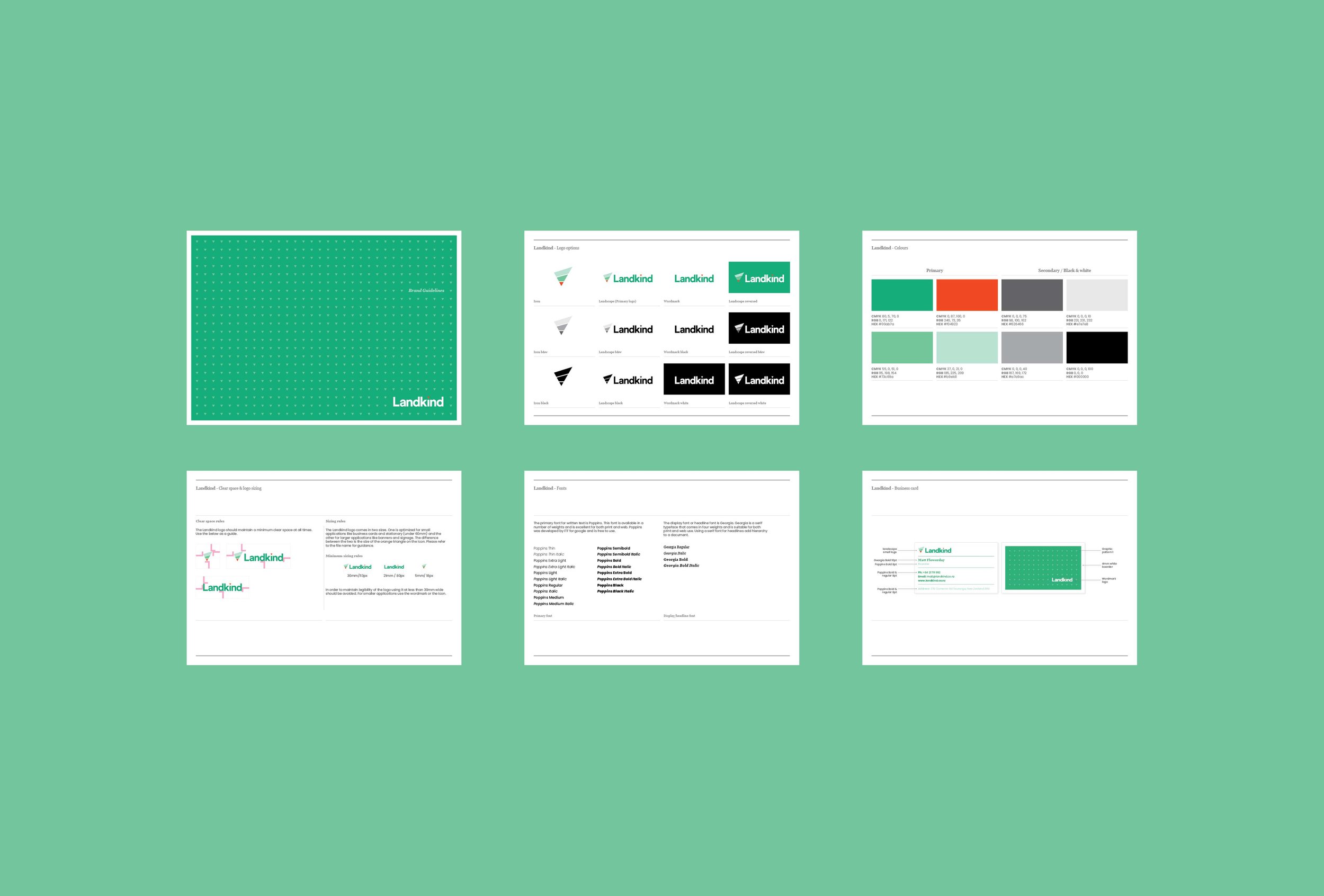
Landkind brand development
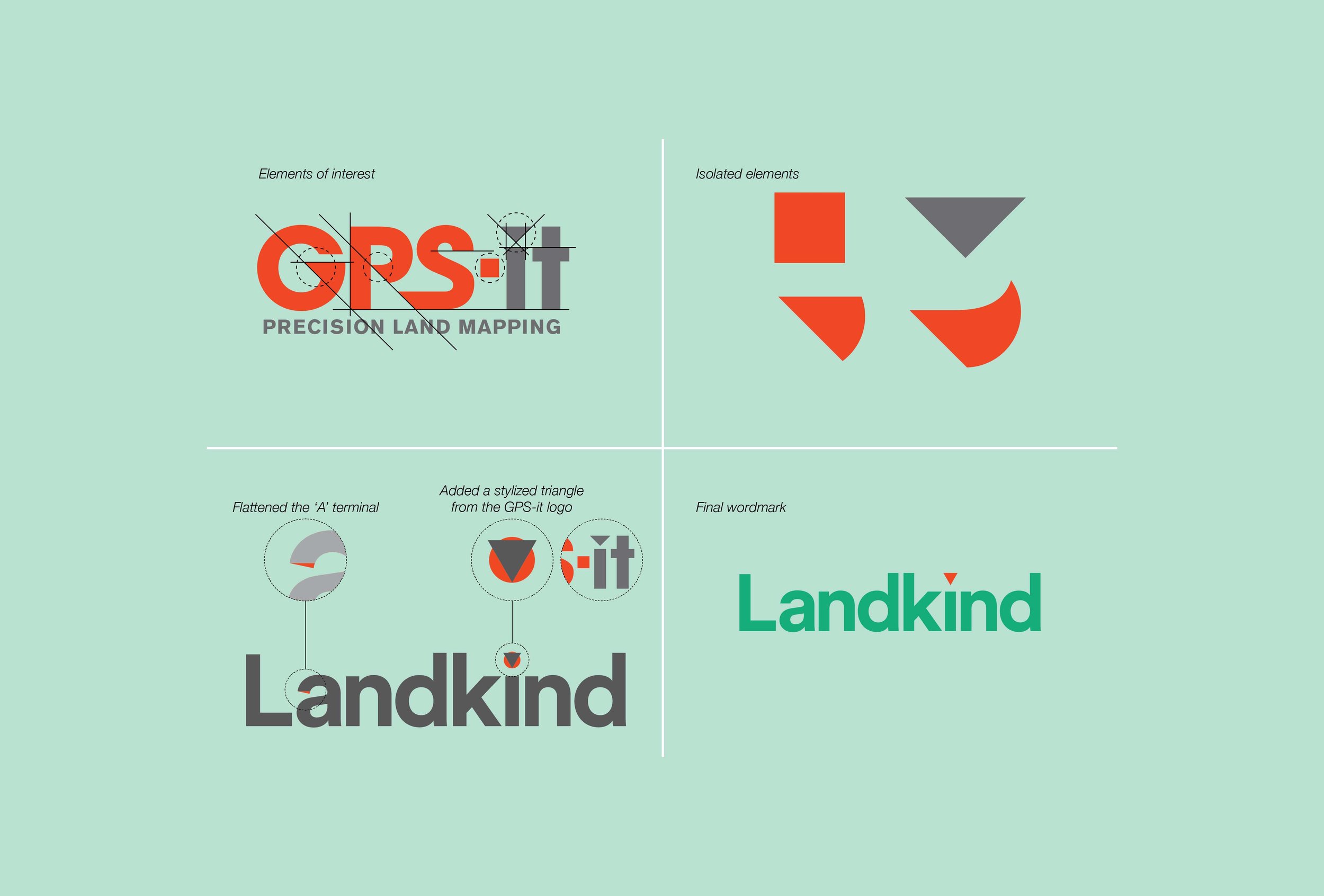
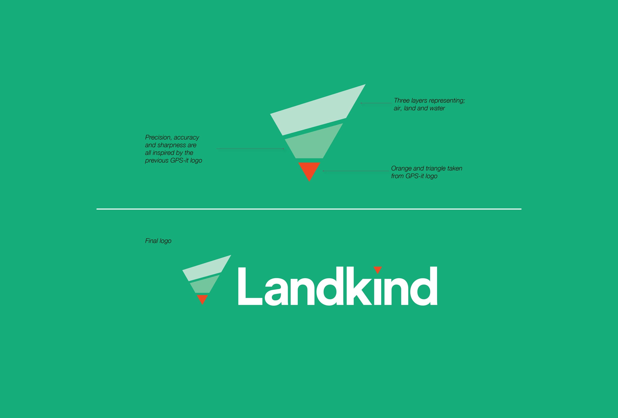
I was brought on to design and develop a logo for a horticulture app, Landkind a subsidiary of GPS-it. This app would be primarily used by the Kiwifruit industry to manage crops throughout the year. Inspiration for this logo came from the original GPS-it logo that was loved by the founder. I used the same angular ethos as this represented precision, accuracy and sharpness. The three layers represent air, land and water. All important elements for crop management.


